Transform the Mood of a Room with Color
October 13, 2017
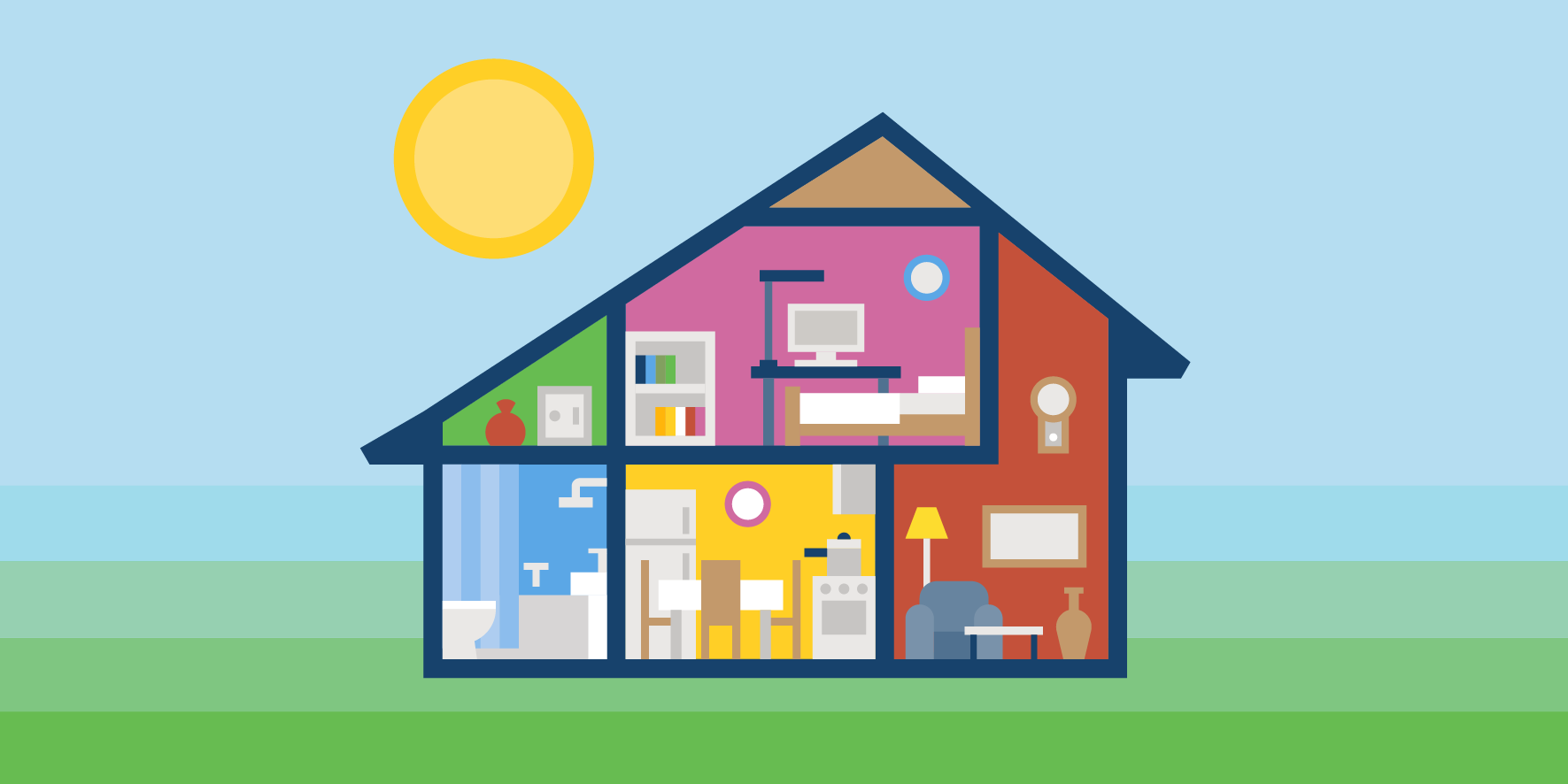
Whether you just moved into your new home or you are looking for a way to shake up the status quo in a home you have been in for years, color can play a significant role in defining the personality of a room. The most immediate example of this is wall color, but some deliberate theming the color of the décor can have similar effects. The colors you choose will not only shape how large or small the room appears, but can also be a driving factor for how you feel while in the room. So, if color is such a key player to the mood of the room, which tone should you go for? We’ve outlined each of the major tonal families below to help guide you in your search for the perfect shade for your perfect space.
Warm Up to the Idea
Warm tones certainly have an energy to them. Located firmly on the side of the color wheel with red, yellow and orange, warm tones can skew from high-energy tones to cozy colors. Be mindful of 1) where you put these colors and 2) how much of them you use. They can be great for pushing a bland room into a showstopper, but too much of these tones can make a room appear smaller. While this might be great for large rooms made for socializing, it can be overwhelming in a small, quiet space, like a bedroom.
Red All About It
Many of the deeper, richer red shades invoke energy and passion in a room. This can be used to great effect in social spaces, like dining rooms and living rooms. The shade wields equal power for stimulating conversation and appetite, making it perfect for these rooms. It also sends a bold message in an entryway, invigorating visitors the minute they walk in the door. Use this color with caution; it can also be known to raise blood pressure and heart rate, or even invoke irritability and hostility. If you just have to have this color in your bedroom, den or study, go for muted tones, like elegant raspberry, over bold crimsons.
Color can play a significant role in defining the personality of a room.

Yellow There
If you seek a more cheerful energy, yellow is your color of choice. Equally the color of sunshine and smiley faces, it is a happy shade that can infuse uplifting energy into kitchens, bathrooms and even dining rooms. Smaller spaces, like entryways and hallways, can also benefit from this chipper tone thanks to its welcoming vibe. As positive as this color can be, the exact shade is everything. “Yield Sign Yellow” does no room any favors, and can create feelings of frustration or anxiety. In fact, babies tend to cry more in yellow rooms (so avoid this color for nurseries unless you are allergic to sleep). Instead, opt for soft, sunny, buttery tones. Because this color is great at reflecting light, it can also be a good alternative for rooms with little natural light or for ceilings.
Orange You Glad I Didn’t Say Banana
Orange brings us right back to the high-octane side of the wheel, infusing enthusiasm and energy into whatever room it touches. A little bit brasher than its rosy cousin, it is recommended to avoid this color for living rooms and especially bedrooms. Instead, think of rooms where you want a lot of positive excitement, like rec rooms or fitness rooms.
Warm tones can be great for pushing a bland room into a showstopper, but too much of these tones can make a room appear smaller.
Cool It
Whereas warm tones make rooms feel smaller, cool tones can make a room feel larger. These colors lend a calmer vibe to rooms, but can also run the risk of feeling too “cold” without ample light sources – natural or otherwise. This side of the color wheel includes blues, purples and greens.
Nothing but Blue Skies
Not surprisingly, blue tones tend to have the opposite reaction of its red counterparts. Blues reduce blood pressure and slow down heart rate, providing a calming and serene attitude to a room. For this reason, it is often recommended for bedrooms or bathrooms. Go for soft tones to avoid leaning toward the sadder vibes associated with deeper shades. Blue is also associated with cleanliness, making it a great color for laundry areas, as well. This color has even been known to improve productivity, so consider it for offices and studies. The main thing to watch for with blue is to avoid a gloomy look, something particularly likely in rooms with limited natural light. For this reason, it is often recommended to go with warmer blues versus pastel shades. If you want to go against the grain and use a cool blue, just make sure to warm up the room with its furnishings and textiles.

Purple Rain
If the thought of purple scares you, we suggest giving it a second chance. This color is extremely versatile. In its lightest values, it delivers the same calming and restful vibes as blue without turning a room into a chilly landscape. For this route, go with lilac or lavender. Feeling a little bolder? Deeper shades of purple (a la eggplant) can be absolutely elegant. Remember, purple was the color of royalty. This color can be luxurious, sophisticated and dramatic in one. If that sounds a little overwhelming, consider it as an accent shade to neutral tones.
Whereas warm tones make rooms feel smaller, cool tones can make a room feel larger.
It’s Not Easy Being Green
Somewhere between chipper yellow and serene blue is green, which pulls in the positive qualities of both those tones. Almost any room in the house can benefit from this juicy shade. It brings a calm, earthy feel to kitchens and dining rooms, while invoking a little energy and comfort into family spaces like living rooms and dens. It brings stress relief in a way that does not threaten to put you to sleep or freeze out your guests. From bedrooms to entryways and everything in between, consider the different shades of this versatile color.
Neutral Country
Remember, color is fun, but to avoid overwhelming your guests, pull in some neutrals in every room. Whether you do this with accent color, furnishings, décor or textiles, be mindful of the tones of your neutrals. White, grey and black come in both warm and cool varieties (just like the other colors) so be sure your accent shade and neutral play well with each other. Also, be very careful how much black you bring to a room. While some experts claim every room needs a little black to give it depth, you do not want to overdo it. Limit this color to small doses.
Whatever crayon box of colors you choose to decorate your home, first and foremost, it is important you love the house you are in! At GCD, we are committed to creating spaces you will be proud to call home for generations – and many coats of paint. If you are ready to take the first step toward owning your own GCD home, please contact us. We’ll even help you with that initial color decision. It’s all part of turning that house into your home.